cruzomundo
A full website redesign and art direction for Cruzomundo Storytelling Academy — taking a credibility gap and closing it through documentary-inspired design.
A full website redesign and art direction for Cruzomundo Storytelling Academy — taking a credibility gap and closing it through documentary-inspired design.

project type:
Website Redesign / Art Direction
year
year:
2025
my role
my role:
Art Director / Designer
client
client:
Cruzomundo Storytelling Academy
project credits:
Design and Art Direction — Tyler Conwell. Photography — Jaap van 't Kruis.
setup
Cruzomundo is a storytelling academy founded by Jaap van 't Kruis, a Dutch documentary filmmaker living in Colombia who has spent 20 years making films for Netflix, VICE, The New Yorker, and the UN. His work teaches leaders, NGOs, creators, and filmmakers how to tell human-centered stories that actually move people.
The problem was that his website didn't reflect any of that.
This was a pro bono freelance project with no agency and no creative director above me. Just me, Jaap, and a site that needed to be rebuilt from the ground up.
Storytelling is rarely a clean or linear process. It's exploratory, iterative, and sometimes a little messy.
insight
The old site had everything it needed to work like real photography, credentials, real workshops. But it also read like a template someone filled in and forgot about. Somewhat generic type and sections that didn't quite build on each other. Nothing that helped you understand who Jaap was or why you should trust him.
More importantly, it felt untrustworthy. Not because anything on it was false, but because bad design erodes credibility before a visitor reads anything. Jaap had 20 years of documentary authority behind him and a website that made Cruzomundo look like a generic coaching service. The visual problems were real, but the deeper issue was that the site was working against him.
After my first meeting with Jaap I quickly learned that he wasn't just another pro-bono client and instead was someone genuinely convinced that human-centered storytelling matters, especially now, when AI-generated content is everywhere and authentic stories are harder to find. That conviction became the creative brief.
The question I kept coming back to: how do you make someone feel the weight of what Jaap does before they decide whether to care?
setup
Cruzomundo is a storytelling academy founded by Jaap van 't Kruis, a Dutch documentary filmmaker living in Colombia who has spent 20 years making films for Netflix, VICE, The New Yorker, and the UN. His work teaches leaders, NGOs, creators, and filmmakers how to tell human-centered stories that actually move people.
The problem was that his website didn't reflect any of that.
This was a pro bono freelance project with no agency and no creative director above me. Just me, Jaap, and a site that needed to be rebuilt from the ground up.
Storytelling is rarely a clean or linear process. It's exploratory, iterative, and sometimes a little messy.
setup
insight
insight
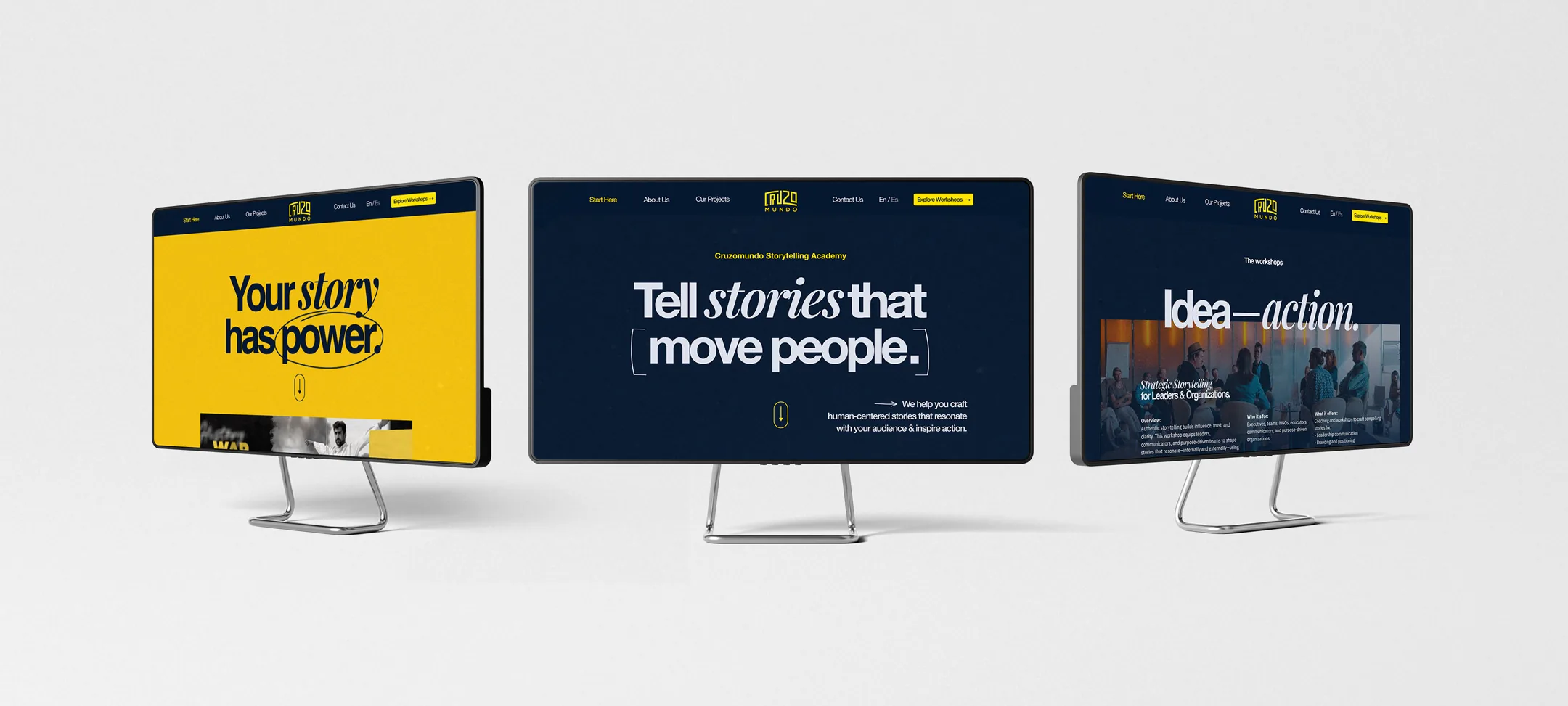
Hero mockups
Home Page Hero animation
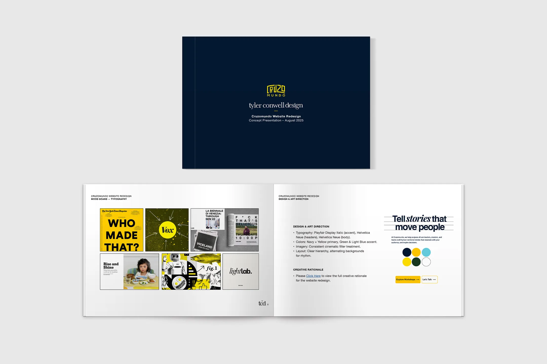
early presentation deck

Responsive setup
execution
The redesign covered the full site: homepage, about, workshops overview, two individual workshop pages, and contact. I handled strategy, UX structure, art direction, wireframes, high-fidelity design, and client presentations. Jaap provided photography and copy direction. I pushed back on structure and hierarchy throughout.
The answer wasn't more copy or a cleaner layout. It was about establishing an atmosphere and visual experience first that communicated documentary seriousness and human warmth. The design couldn't look like a course platform or a coaching website. It had to feel like it belonged in the same world as the work itself.
Part of that meant pushing the visual language further than what you typically see in web design. A lot of my inspiration came from editorial design, print publications, and documentary filmmaking — spaces where designers are actually encouraged to create atmosphere and emotion through composition, not just organize information clearly.
So rather than going polished and corporate, I leaned into something more tactile and human. Contrasting typefaces, tight leading, layered imagery, handwritten annotations, tape textures, scribbled arrows, brackets, overlapping elements. Things that might look somewhat spontaneous but were also placed with intention. Storytelling is rarely a clean or linear process — it's exploratory and iterative and sometimes a little messy. I wanted the design to reflect that reality rather than clean it up.
outcome
The visual system draws from documentary filmmaking and editorial journalism, with full-bleed photography, high-contrast type, and a restrained navy and yellow palette with enough warmth to keep it human. The type pairing, Playfair Display Italic with Barlow Condensed, creates tension between editorial character and confident clarity. Neither choice is safe. Both are intentional.
The workshops got their own pages and clearer audience segmentation: Strategic Storytelling for Leaders and Organizations, and Cinematic Video Storytelling for Impact. Two different audiences, two different conversion paths, one shared emotional idea. The existing logo stayed. It was strong and didn't need to be touched.
The full design system was handed off to Jaap for implementation, including wireframes, high-fidelity comps, rationale documentation, and guidance for future content expansion. Jaap was excited and happy with where things landed.
Believing in a client's work is not a prerequisite for good design. But when you do believe in it, something different happens. You stop designing a website and start designing an argument. Cruzomundo needed someone to look at what Jaap was actually doing and build a digital space worthy of it.
execution
execution
outcome
outcome
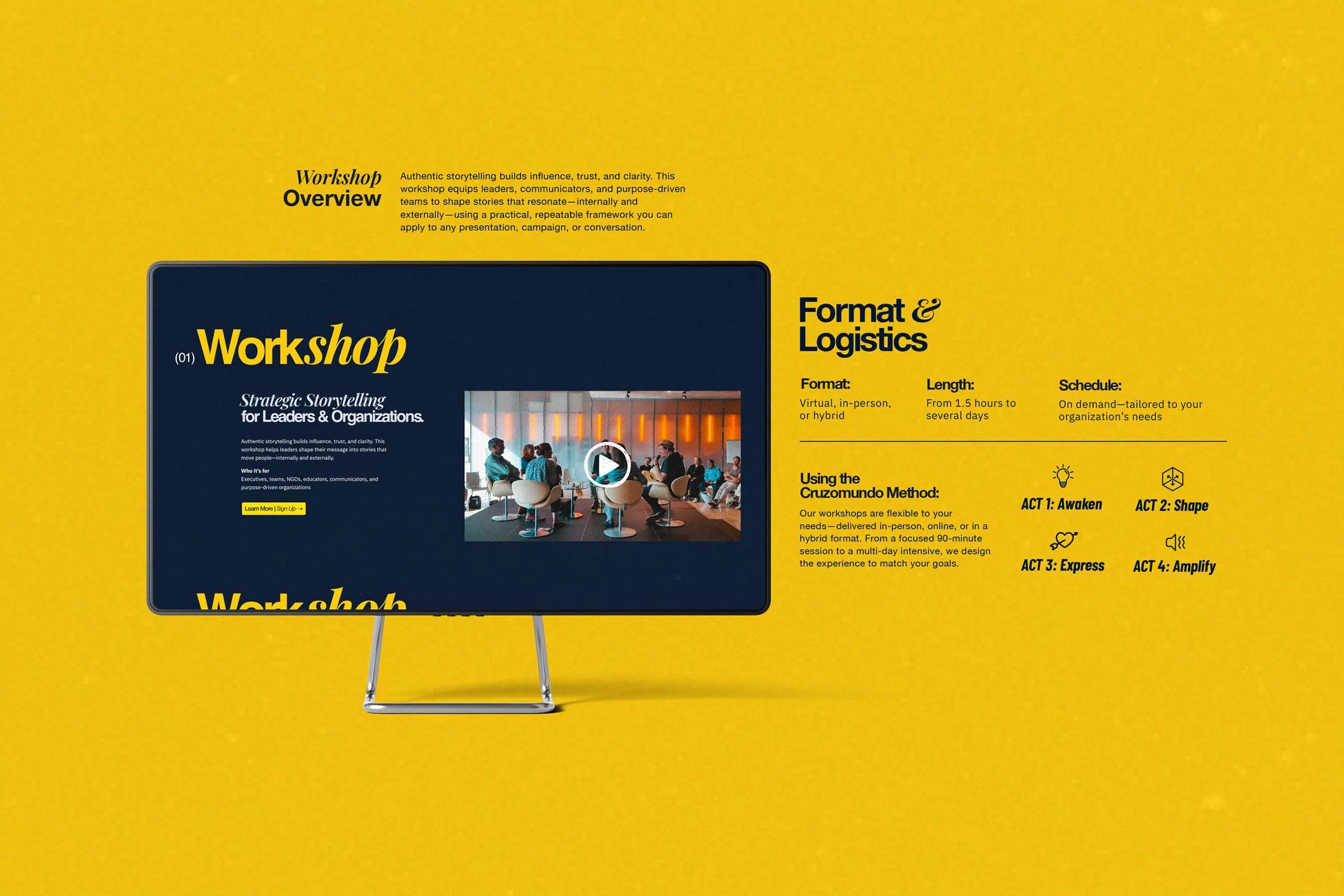
workshop overview page
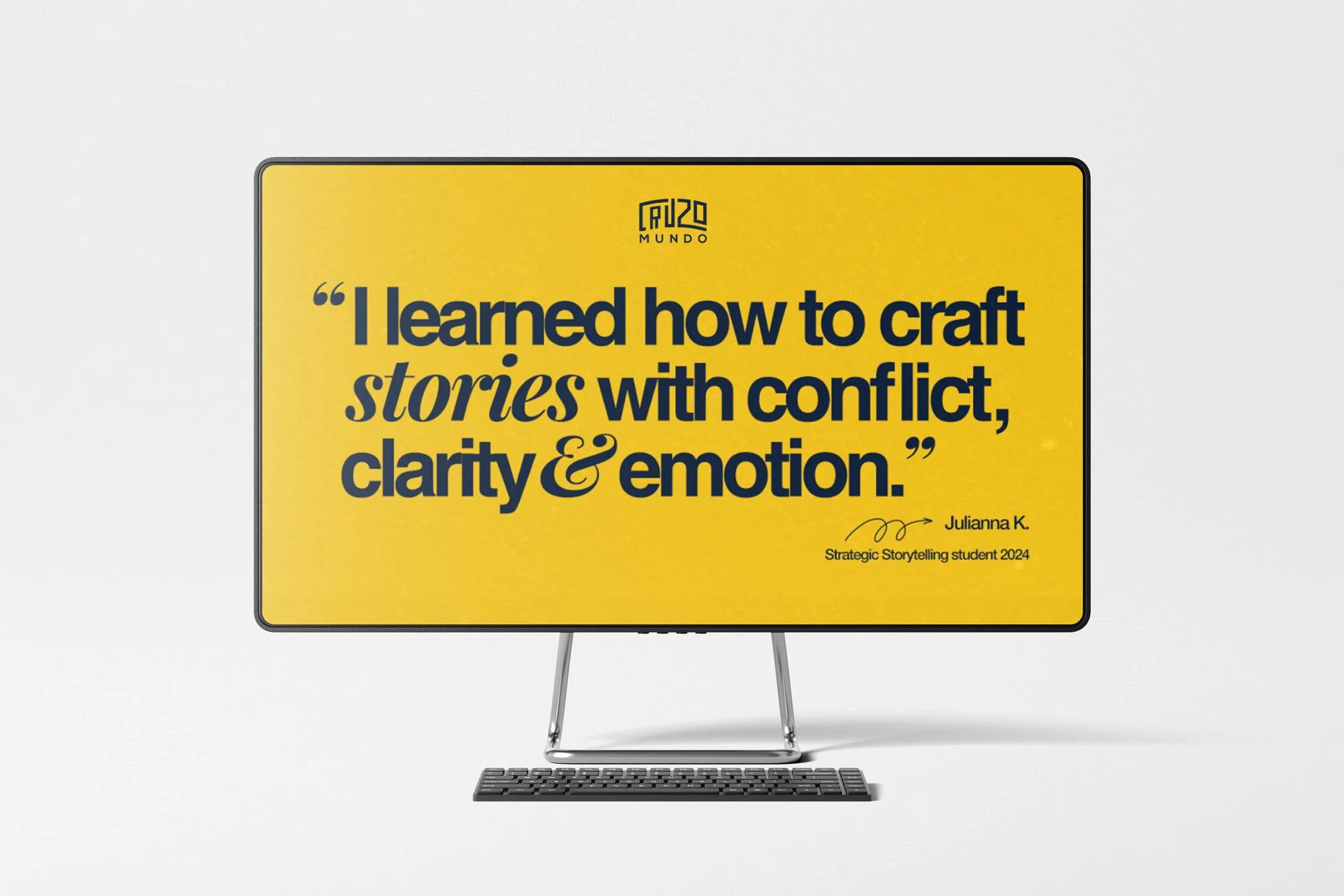
site typography


