lifetime brand
Two years building and governing Lifetime Home Remodeling's brand across print, digital, OOH, motion, and editorial.
Two years building and governing Lifetime Home Remodeling's brand across print, digital, OOH, motion, and editorial.

project type:
Brand Stewardship
year
year:
2024–2026
my role
my role:
Design, Art Direction
client
client:
Lifetime
project credits:
Brand System: Workshop Built (2024 rebrand — the system this work was designed inside of) · Creative Direction: Adam Helm · Graphic Designer: Noelle Betkowski
context
I joined Lifetime five months before the new brand launched. That put me in the final meetings between Workshop Built, leadership, and the marketing team, and made me one of the people responsible for making it real across the company.
At launch, Lifetime was a growing home remodeling company with offices across Denver, Arizona, and Southern California. The brand book was 45 pages. Almost nothing inside the company matched it yet.
Stewardship, in practice, meant designing across roughly twenty touchpoint types simultaneously while building the templates, audits, and systems that kept the work coherent as the marketing team scaled.
The brand book was 45 pages. My job was making sure the other 300 people acted like they'd read it.
The work
The judgment call was always the same: hold the brand tight where it had to read as the brand (logos, lockups, the badge shapes, the typographic hierarchy) and let layout, photography, and pacing flex where the piece called for it. A magazine ad in Forbes shouldn't read the same way as a recruitment brochure, but they should both read as Lifetime.
Internal work made up the slower, less visible half. Recruitment brochures, PowerPoint templates, installer hats, a box-truck wrap with a modular vinyl system so service badges could be swapped without reprinting the whole truck. The launch video introducing the brand at the company all-hands is still one of Lifetime's three pinned Instagram posts.
Customer-facing and partnership work ran on a tighter schedule: magazine ads, newspaper takeovers, Broncos sponsorship graphics, vehicle wraps, retargeting display. By December 2025, the creative was measurably outperforming industry norms according to third-party research benchmarks.
In summer 2025, Noelle and I produced a full brand audit that shifted the work from making the brand to governing it. It's what led to my promotion to Creative & Design Manager.
context
I joined Lifetime five months before the new brand launched. That put me in the final meetings between Workshop Built, leadership, and the marketing team, and made me one of the people responsible for making it real across the company.
At launch, Lifetime was a growing home remodeling company with offices across Denver, Arizona, and Southern California. The brand book was 45 pages. Almost nothing inside the company matched it yet.
Stewardship, in practice, meant designing across roughly twenty touchpoint types simultaneously while building the templates, audits, and systems that kept the work coherent as the marketing team scaled.
The brand book was 45 pages. My job was making sure the other 300 people acted like they'd read it.
context
The work
The work
Rebrand Sizzle Reel

Business cards, 2025.

Recruitment brochure, a colleague and myself talking
Where it went
The brand got pushed furthest in three places. The National Western Stock Show sponsorship, where the brand had to hold up next to a 100-year-old Western institution. The Life Times, an internal quarterly newspaper for employees across all three markets. Those case studies live alongside this one. The motion graphics system — video, OTT, and stadium LED — is coming.
related work
Where it went
Where it went
related work
related work
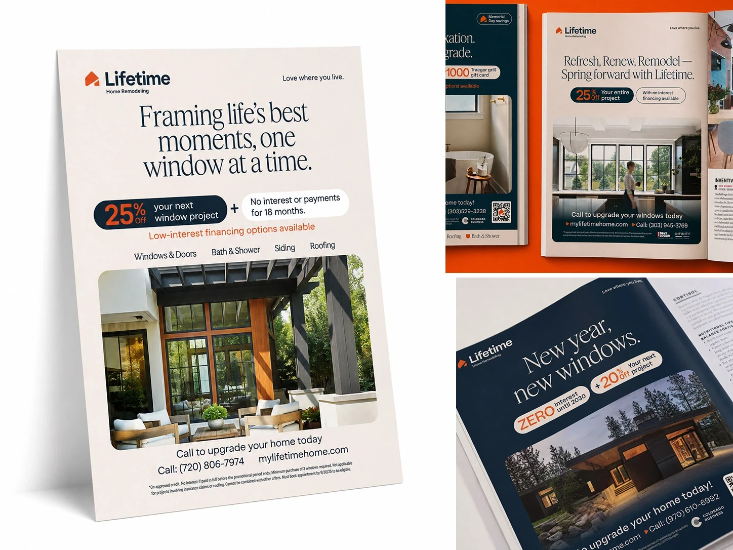
Magazine ads, print.

digital ads, 300x600


