the life times
Concept, art direction, and design of The Life Times, a 12-page quarterly publication for Lifetime Home Remodeling's 500+ employees across Denver, Phoenix, and Southern California.
Concept, art direction, and design of The Life Times, a 12-page quarterly publication for Lifetime Home Remodeling's 500+ employees across Denver, Phoenix, and Southern California.

project type:
Editorial Design
year
year:
2025
my role
my role:
Creative lead
client
client:
Lifetime
project credits:
Editor in Chief: Adam Helm · Copy: J.C. Gage · Graphic Designer: Noelle Betkowski
setup
Lifetime Home Remodeling had grown to over 500 employees across Denver, Phoenix, and Southern California. Leadership wanted a quarterly publication that would actually circulate. Something employees would read and keep, not glance at and toss in a drawer.
The design problem was finding the right place to land between two opposing references. On one side, the Lifetime brand, a home remodeling company that has to feel trustworthy. On the other, more of a cultural newspaper — expressive, illustrated, arts-district energy.
insight
The publication needed two qualities at once. Professional enough that leadership pages like "The First Word with Brian" and "P.S. with Peter Svedin" felt at home. Expressive enough that the average employee would pick it up because it didn't look like an HR document or a Mailchimp email.
The Life Times sits on Lifetime's brand vocabulary — Feature Display, Beatrice, the navy and warm orange palette, certificate-style borders lifted from existing brand collateral. On top of that foundation, we layered the expressive: large page numbers, textures, hand-drawn notes, playful typography. The brand is the foundation. The expressive layer is what makes it feel like a publication you'd want to read.
setup
Lifetime Home Remodeling had grown to over 500 employees across Denver, Phoenix, and Southern California. Leadership wanted a quarterly publication that would actually circulate. Something employees would read and keep, not glance at and toss in a drawer.
The design problem was finding the right place to land between two opposing references. On one side, the Lifetime brand, a home remodeling company that has to feel trustworthy. On the other, more of a cultural newspaper — expressive, illustrated, arts-district energy.
setup
insight
insight
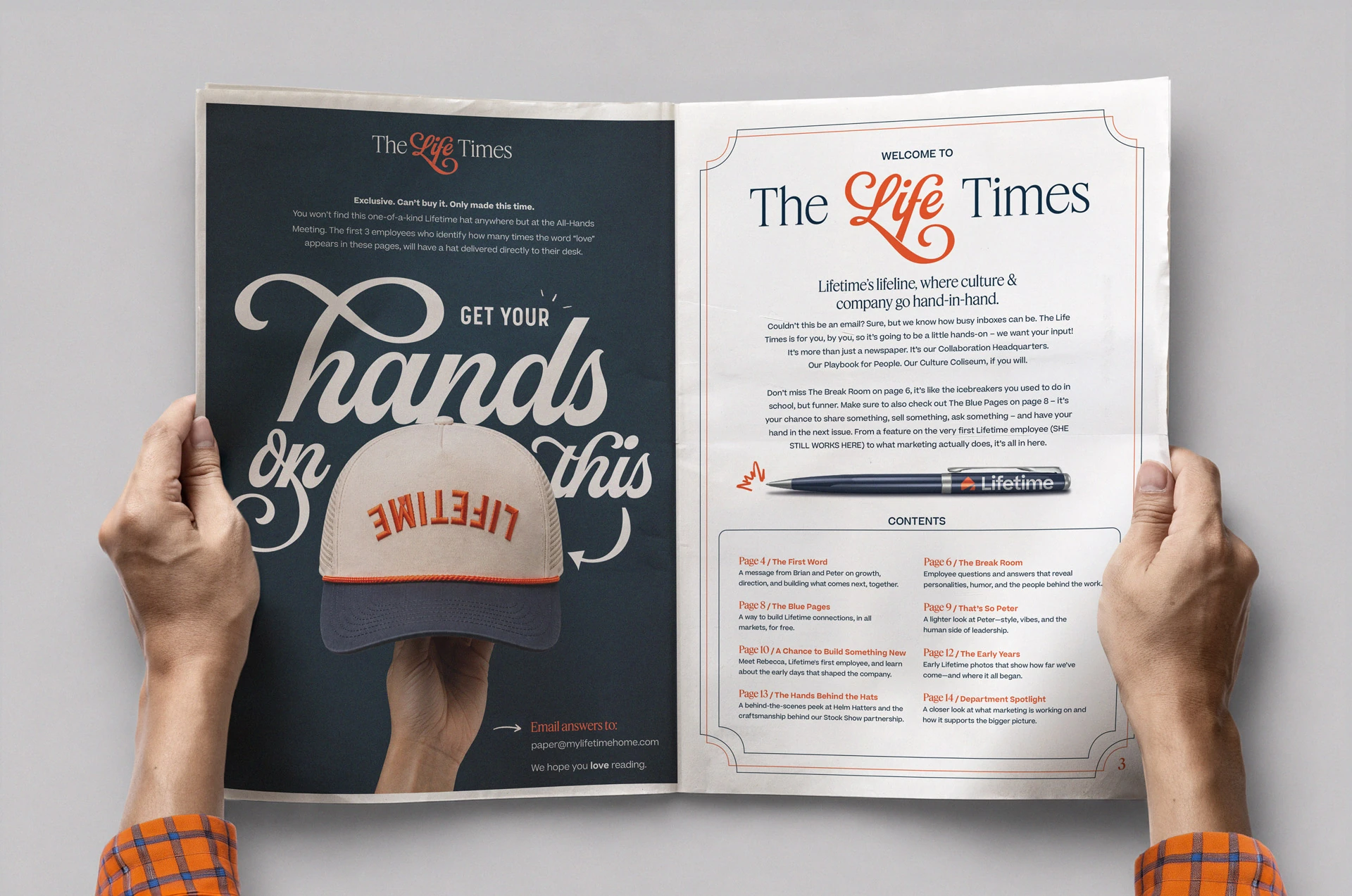
First spread / Issue 01
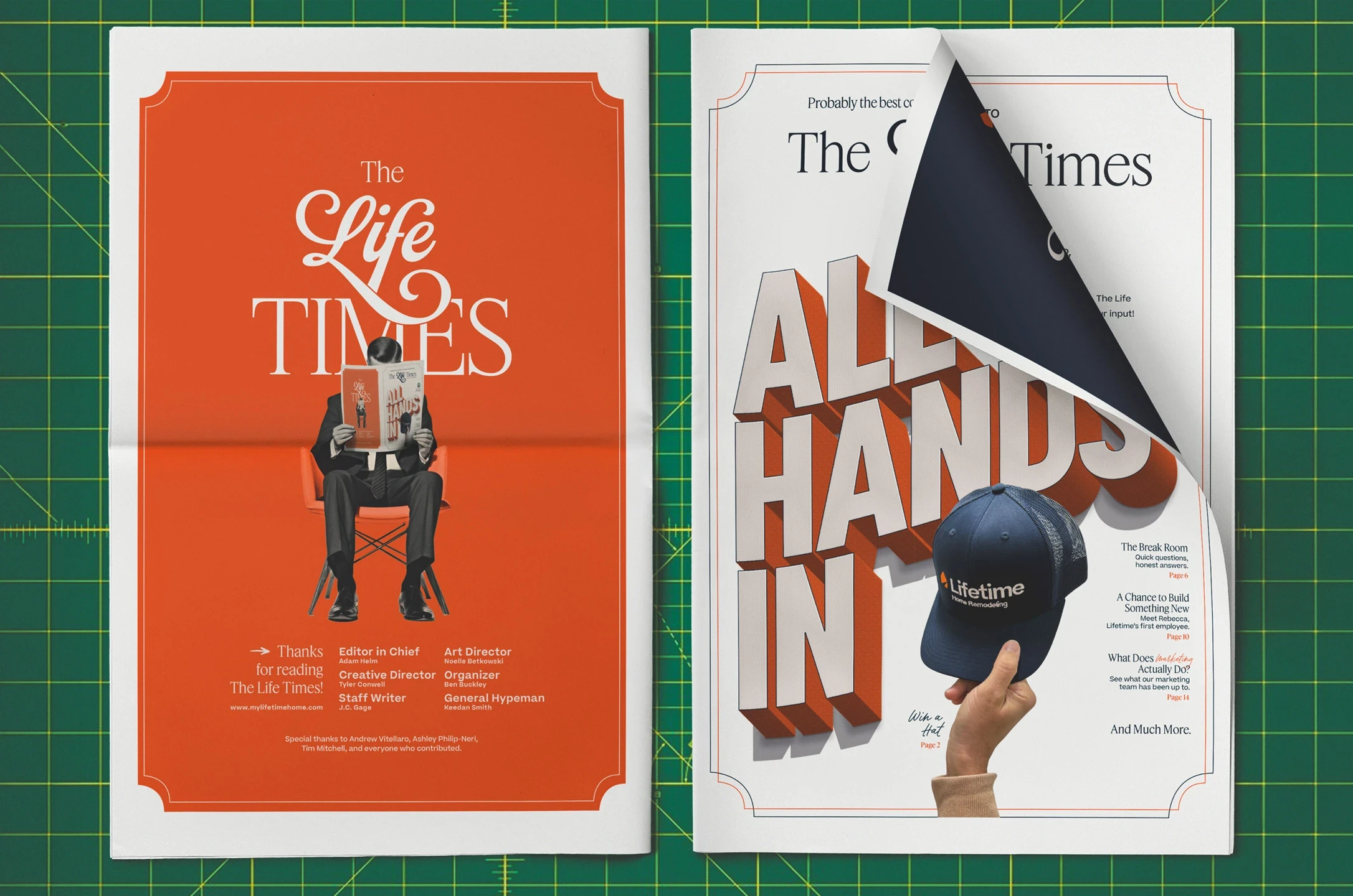
front and back cover / issue 01
Execution
Each issue runs twelve pages, printed quarterly at 500. One per employee.
Recurring sections like The Break Room, and The Blue Pages were built around content submitted by employees across all three markets. A custom embroidered cap was designed as a giveaway, available only by reading the issue and finding a hidden word-count puzzle.
"Better than what I saw at a multi-billion dollar company."
Outcome
Issue one shipped to all three markets and was distributed at the company All-Hands. The Life Times became Lifetime's recurring internal quarterly, and the wordmark, page system, and section architecture set the template subsequent issues have followed.
The response said more than any metric could. Brian, Lifetime's CEO, called the quality better than internal publications he'd seen at a multi-billion dollar company. Employees wrote in unprompted — 'I already can't wait to read the next one.' 'I miss reading the paper.'
The challenge on most projects with a brand system this defined is restraint, knowing what not to do. The challenge here was the opposite.
Execution
Execution
Outcome
Outcome

Issue art work
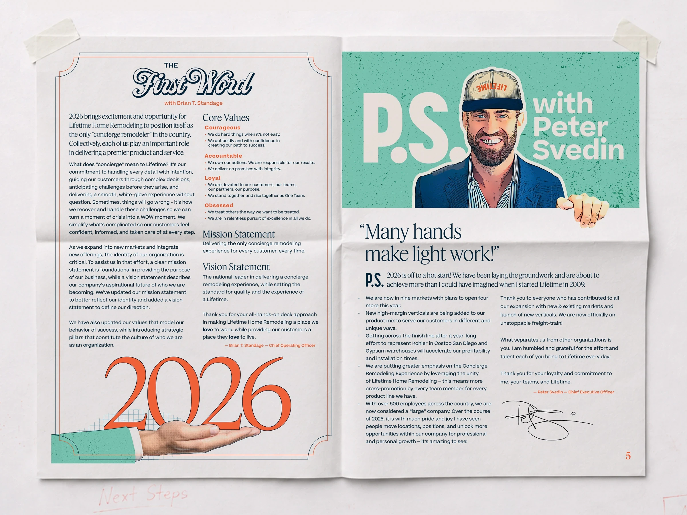
the first word and p.s. with peter svedin


